
Site header
What the header of a Clinia site holds, how it behaves on the home page, inner pages and phones, and what to keep out of it.
What the header does
The header tells users which Clinia site they're on. It lets them search the site, move between its sections and reach its main action. The developer documentation and the help centre share one header, so a user crossing from one to the other keeps their bearings.
Anatomy
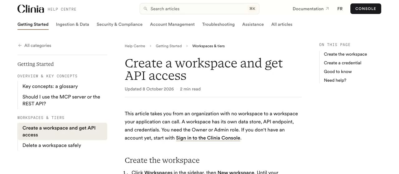
On a wide screen the header has two rows.
- Site row: the product lockup on the left, search in the centre, and the utilities on the right.
- Section tabs: one tab per top-level section of the site, with the current one marked.
- 1Product lockup
data-slot="header-lockup" - 2Search
data-slot="header-search" - 3Utilities
data-slot="header-utilities" - 4Section tabs
data-slot="header-tabs" - 5Current tab
data-slot="header-current-tab"border-accent
| Part | What it holds | Rule |
|---|---|---|
| Product lockup | The wordmark and the site's name | Links to the site's home page. See Logo. |
| Search | A field-shaped button that opens the site's search | Centred, with its keyboard shortcut shown. |
| Utilities | Links to other Clinia sites, then a link to a page of this site that users need from anywhere, then the language, the theme and the main action | Right-aligned. Only what the site needs: a site without a dark theme has no theme switch. The help centre's page link is Submit a request. |
| Section tabs | The site's top-level sections, in its own order | Pages on this site only. |
Home page and inner pages
Inner pages
Inner pages set the header on a solid panel in the page's background colour, edge to edge. No line sits under it: once the page scrolls, a soft shadow fades in and separates it from the content.
The home page
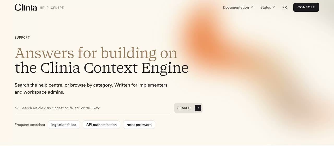
The home page header starts transparent, over its hero. When the page scrolls, the panel slides down behind the header. The hero runs up under the header: pull it up by the header's height, or a strip of page colour shows above the hero. The home page can drop the search when its hero holds a search field, and the tabs when the page lists the sections itself.
Phones and tablets
Below 1024px the tabs move into a menu. The site row keeps the lockup, a search button, the language and a menu button. Links to other sites and the page link move into the menu with the tabs.
Getting Started
Getting Started
Do and don't
Also:
- Keep the header identical on every inner page of a site. Only the current tab changes.
- Keep tab labels to one to three words. If the tabs don't fit at 1024px, cut a tab rather than shrink the text.
- Open links to other sites in a new tab.
- Keep the header the same height as the page scrolls: never shrink or hide it, and never use Vital in it.
Accessibility
- The header is a
headerlandmark, and the tabs anavwith its own label. - The current tab carries
aria-current="page", so screen readers announce it too. - Every control is at least 24px tall and shows the focus ring.
- The search button names its shortcut. Closing the search returns focus to the button that opened it.
- With reduced motion, the home page's panel appears without sliding.